Icons
Nile provides a library of scalable vector icons that can be used in user interfaces. The icons are designed to be easy to use, customizable, and accessible, and are available in a range of styles and formats.
Overview
Nile Icon component lazy-loads icons
Usage
Place the icon element on the page and give it an icon name from the [default icon set][icon-sets]. In most cases, the icon should be labelled using aria-label or aria-labelledby, or removed from the accessibility tree with aria-hidden="true" or role="presentation", if its content is merely presentational and expressed using accessible text copy elsewhere.
<nile-icon name="user" aria-label="user"></nile-icon>
<nile-icon name="lock" aria-label="lock"></nile-icon>
<nile-icon name="laptop" aria-label="laptop"></nile-icon>
<nile-icon name="cloud" aria-label="cloud"></nile-icon>
Sizes
The default size for icons is 16 pixels. To set a specific icon size, simply pass the desired size in pixels as a number.
<nile-icon name="user"></nile-icon>
<!-- Default: Icon size is 16 pixels -->
<nile-icon name="user" size="12"></nile-icon>
<!-- Icon size is 12 pixels -->
<nile-icon name="user" size="20"></nile-icon>
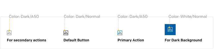
<!-- Icon size is 20 pixels -->Colors
You can specify the color of the icons using either named colors or hex values.
<nile-icon name="user" color="blue"></nile-icon>
<!-- Using named color -->
<nile-icon name="user" color="#000000"></nile-icon>
<!-- Using hex value -->
customSvgPath
If provided, the customSvgPath property allows you to specify a custom path from which the component will fetch and display the SVG content. This is especially useful if you want to use your own SVG designs that aren't part of the built-in icon set.
<nile-icon customSvgPath="assets/users.svg"></nile-icon>All Icons
There are 447 in the icon system in nile
Anatomy
Anatomy of a Icon
Attributes & Properties
| Name | Description | Type | Default |
|---|---|---|---|
| name | The icon name to render | string | '' |
| customSvgPath | A path to a custom SVG file to display as the icons | string | '' |
| description | aria-label for svg | string | '' |
| method | svg method | 'fill' | 'stroke' | 'fill' |
| size | size (size X size) of the icon | number (px) | 16 |
| frame | frame size (viewBox) of svg (`0 0 ${frame} ${frame}`) | number (px) | 16 |
| title | Title for the component | string | '' |
| color | icons color | string,(default css color types (hex, names, etc.)) | '#7F7F7F' |
List of Depreciated Icons
To streamline our icon library, we’ve deprecated legacy icon names in favor of these new icon names. Please refer to the table below when updating your code.
| Depreciated Icons | Mapped Icons |
|---|---|
| userremove-1, userremove-2, deleteuser, user-inactive | userremove |
| header-actions, actionworkflow, applications | action |
| block-02, componentblock, flowmap-block | block |
| calendar-01 | calendar |
| play-circle | play |
| setting, settings-1 | settings |
| trash, trash-01, trash-no-fill, trash-03 | delete |
| download-01, download-02 | download |
| data-type-persistent-variable | persistent-variable |
| leftarrow | arrowleft |
| rightarrow | arrowright |
| search-lg | search |
| info2, info-icon1, info-circle | info |
| dropdown, flowmap-ellipsis, dots-vertical | options |
| bell-icon | notification |
| database-1 | database |
| stop-circle | stop |
| agents | agent |
| event | trigger |
| edit-pencil, pen, edit-write, shape, edit-01, updateuser, edit-1 | pencil |
| notscheduled, not, flowmap-cancel, cancel, x-circle | error |
| undo-1 | undo |
| privilage, privilegeobject | privilege |
| bell | mute |
| bar-chart-square-03 | bar-chart-square-02 |
| help-circle, help-1, caution | helpandsupport |
| smalltick, check | tick |
| user-selection, selectuser | useractive |
| user-group, multiple-user | group |
| user-square, user-analysis-icon, user-circle, user-03, personaldetails, user-01 | user |
| workflow-orchestration | flowmap-orchestration |
| workflow-01, workflow-solid | flowmap |
| section-02, flowmap-section, workflow-section | section |
| variable-new-1 | variable-new |
| rolemanager | role |
| manageduser | manage |
| folder-01 | folder |
| header-functions | script |
| users-01, users-02, ou-analysis-icon | users |
| draglist, flowmap-drag, itemplaceholder, placeholder-wf | drag |
| anomaly | thumbsdown |
| no-anomaly, approve | thumbsup |
| enabled | enable |
| themes, palette | color |
| expand-1, chevron-selector-vertical | sort |
| default-1, custom, basic | default |
| droparrow, next-down, chevron-down, downarrow | arrowdown |
| plus-icon | pluscircle |
| flow-01 | condition |
| table-1 | logs |
| flowmap-text, workflow-text | text |
| layers-three-01 | layers-three-02 |
| uparrow, chevron-up, prev-up | chevron-up |
| header-variable, data-type-variable | variable |
| variable-local-1 | variable-local |
| refresh-cw-03 | refresh |
| flowmap-hand | handtool |
| revokation-cycle | revocationcycle |
| send-prompt | send |
| while | while-loop |
| data-type-encryption | js |
| flowmap-redo | arrow |
| continous,every | frequency |
| flowmap-aquera | aquera |
| form | document |
| next | arrowright |
| prev | arrowleft |
| application | selectapplication |
| attributemap | flow-h |